
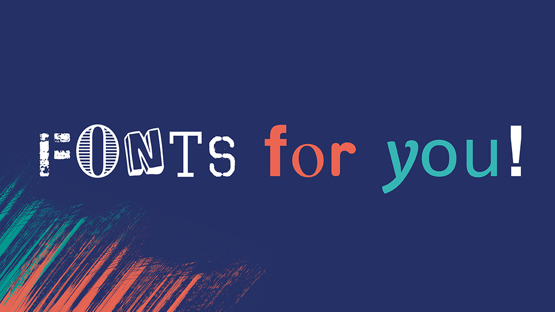
There are literally loads of fonts, so where to start? Here we share some common font categories to help you decide which one is best for your brand:
This font has small lines (serifs) at the ends of character letters. Regarded as a traditional font and often associated with formality and readability in print.
Examples: Times New Roman, Georgia, Garamond.
No serifs, just clean and simple lines. A more modern look for a more contemporary style.
Examples: Arial, Helvetica, Gill Sans.
Feature bold serifs, conveying a strong and stable appearance.Often used for logos and headings.
Examples: Rockwell, Clarendon, Courier.
This font mimics handwriting or calligraphy creating a more personal touch.
Examples: Brush Script, Lucida Calligraphy, Pacifico.
Designed just for headlines and logos, not for reading body copy, often more decorative and attention-grabbing.
Examples: Impact, Cooper Black, Playbill.
Each and every character takes up the same horizontal space making it perfect for digital coding or when precise alignment is needed.
Examples: Courier New, Consolas, Monaco.
Taking script fonts to a new level, these fonts literally look like they’ve been handwritten, feeling more casual, informal and very personal.
Examples: Comic Sans MS, Bradley Hand, Kristen ITC.
Very stylised and unique, maybe just like your brand?
Examples: Jokerman, Papyrus, Bauhaus 93.
Here the characters are more narrow and tightly spaced, useful for saving space or creating a modern look.Examples: Franklin Gothic Condensed, Arial Narrow. To make it more confusing some fonts fall into multiple categories or some are so unique they don’t have a category!
Read our ‘What the font?‘ feature to help you decide which one is right for your brand.