
You might be surprised how much your brand font says about your brand so it’s important to choose the best fit. When working on a new brand identity we work through the following steps to choose the best font:
Think about your brand personality and values. What tone of voice do you want to have? Are you serious, playful, informal, or witty maybe? Deciding this massively influences the choice of font.
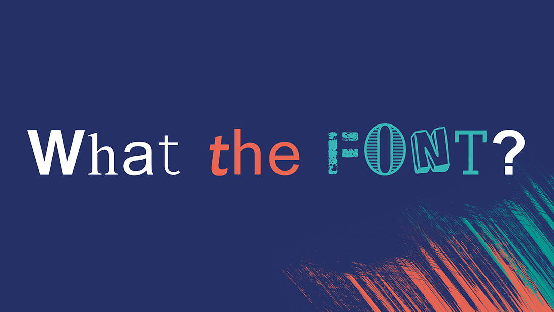
Have a look at the different fonts available – there’s so many font families to review such as serif, sans-serif, script, and display fonts. A good place to start is to look at other brands you like or regard as a peer for your brand.
Sounds obvious but some fonts are easier to read than others. If it’s not legible to your target audience then it’s a non-starter. Think about the formats and instances you’ll be using the font to decide if it will work in that space at that size. Sometimes you can use more stylistic fonts just for big headlines for a bit more impact, using a complementary font in other instances.
Then ask yourself – does anything about the look of the font you like match my brand personality or tone of voice? For example, choose a clean and modern sans-serif font for an innovative brand or a classic serif font for a more traditional or authoritative image.
Ensure that the font works well across different platforms and applications, from digital to print. Consider how the font looks in various weights and styles to maintain consistency.
It’s quite common to have a different font for headlines than body copy. Experiment with combining fonts to establish a visual hierarchy, choosing a primary font for headlines and a secondary font for body text to create a balanced and cohesive look.
We then give the fonts a road test by using them in mock-ups or sample designs. Decide if you think the font suits the message it is writing, if it presents the right brand impression?
Be aware of industry trends and standards but don’t be afraid to add a unique touch to stand out. Consider accessibility standards to ensure that fonts are readable for individuals with visual impairments, using sufficient contrast and avoiding fonts with overly thin strokes.
It’s great if you can get feedback from your target audience or colleagues to ensure the font resonates with your brand message. You might be surprised how others perceive the font, proving why it’s worth putting so much care and attention into choosing your font.
Check the licensing and usage restrictions of the font to avoid legal issues. Fonts do expire and change all the time so be prepared to evolve your font over time to ensure it remains usable.Hopefully, you’ll never view a font so flippantly again after reading this!
Read our ‘Fonts for you‘ feature for a whistle stop tour of fonts!